The Gift of Data (Part 4)
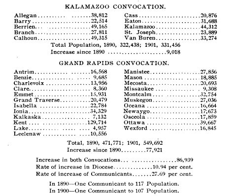
In my last post (shockingly long ago due to a death in the family, summer vacation for my children, and too many church-related engagements for me–sorry!), I described the way our diocese used to track affiliation data: in reference to the wider population. This was the relevant graphic:

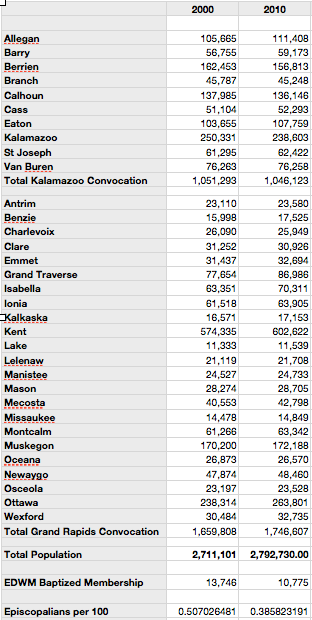
Our diocese no longer provides this data as part of our Convention Report. However, it only took me 20 minutes to look up a secular source for Michigan population by county and a source for Episcopal population, copy the information into a spreadsheet by hand, and run some quick formulas.

From these more recent numbers, a few things are immediately clear:
- The number of people within the diocesan boundaries continues to grow. Population has tripled in the last hundred years.
- The proportion of Episcopalians has not kept pace with population growth.
- About thirteen years ago, 1 in 200 people in this region was an Episcopalian. Numeric decline means that is no longer the case.
Nobody could be surprised by this. What’s surprising is that we never talk about numbers in these terms. If we talk about Average Sunday Attendance, we compare it to – you guessed it – last year’s Average Sunday Attendance. Or, we compare it to the ASA of the church across town or across the diocese. Self-referential data has a place, but focusing on it while ignoring larger population growth data is short-sighted. An organization that pays no attention to its place in the wider society cannot expect to thrive.
Today, with the rise of the Internet, it would be possible to deliver data to congregations and dioceses about their size relative to the population around them. But at this point, I am not aware of any effort to calculate size of communicants vs. size of total diocesan population. It depends on weird people like me making spreadsheets.
In the Episcopal Church, congregations might think they can take their parochial report in one hand and the Community Profile report available online from the Episcopal Church Center in the other. They would be wrong. Those reports calculate data based on a 3-mile radius, no matter whether your congregation is in a major urban center (where people will regularly commute beyond three miles for church) or a rural area (where people will do the same!). Thus, for the purposes of calculating population data in context, they are relatively useless. (They’re better for developing a strategy for community service.)
Jesus commanded us to go and make disciples. How on earth can we know if we’re fulfilling that commandment without looking at data in a larger context?
Next up: how do you deal with data when it’s depressing? Because we’ve surely got depressing data here. Any hints? Please leave them in the comments!


Member discussion